PageLayout: The Only Layout Manager You Will Ever Need
Introduction
PageLayout is a Layout Manager for Java Swing/AWT that encapsulates, in a single package, the functionality of many other Layout Managers. It allows you to lay out components in appropriately aligned rows, columns, and grids. The elements of rows, columns, and grids may themselves be rows, columns and grids of components. As a result, relatively complex layouts can be managed with code that is compact and conceptually quite straightforward to understand and, therefore, maintain.
First Example
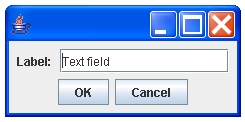
We start with a simple example for the dialog box show below.
 // Create components
 JFrame frame=new JFrame();
 Container container=frame.getContentPane();
 JTextField text=new JTextField("Text field",15);
 JLabel label=new JLabel("Label: ");
 // Top Row
 Row row1=new Row(Row.NO_ALIGNMENT,Row.CENTER,label,text);

 // Bottom Row
 Row row2=new Row(Row.CENTER,Row.NO_ALIGNMENT);
 row2.add(new JButton("OK")).add(new JButton("Cancel"));

 // Size constraint. Constrain the height of the editor
 //   to be 1.5 times the height of the label.
 // (Just for illustration. In the latest version textfield
 // heights are automatically fixed to be 1.5 times label heights.)
 row1.linkHeight(label,new Component[]{text},new double[]{1.5});

 // Put the two rows in a column.
 Column column=new Column(row1,row2);

 // Create the PageLayout and set it to be the container's layout.
 column.createLayout(container);

 frame.pack();
 frame.show();
Evidently, the components are first laid out in two rows. The rows
are placed in a single column, and, following the imposition of
a size constraint, the layout manager PageLayout is
instantiated by calling the createLayout method of the column. Note
that this
method also silently sets the created PageLayout object as
the layout manager of
the container and adds the various components in the rows
to the container. Moreover, the fill areas required to align the components in
the horizontal and vertical directions are inserted automatically based
upon the specified alignments.
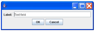
In this particular example, the only component that can grow or shrink is
the TextField, and, as expected, when the frame is resized, its length
is automatically changed, as shown in the following figure.
The basic procedure for laying out more complex GUIs consists of the same three steps.
- Lay out the components in (possibly nested)
cells, of which rows and columns are two examples, - If necessary, impose constraints on the relative and even absolute dimensions of the components, and
- create the
PageLayoutobject by callingcreateLayoutmethod of the top levelcell.
When one or more of the existing layout managers available with the
standard Java distribution (up to JDK 1.5) are used, it is often necessary
for the programmer
to lay out the components in
nested panels (objects of the type
javax.swing.JPanel), each with its own layout manager, for even the simplest nontrivial GUIs, as this may be the only method that can overcome the
limitations of these managers. In principle, it is possible to use this idea to
construct a framework similar to PageLayout that uses nested panels but
hides many of the details of such an approach. However,
the PageLayout and the associated classes
avoid this unnecessary complexity much more simply and naturally
and for most cases PageLayout can be used without
adding extraneous
Swing components just for the purposes of the layout.
Summary of the Algorithm Used
The basic concept used in PageLayout is that of a Cell which
represents a rectangular area in the container. There are two types of
cells. A primitive cell is either a
component cell that contains a single component with a configurable
strip of empty space around it, or simply a gap which is
just an empty rectangle.
The composite cells, on the other
hand, contain other cells, which may be both primitive cells as well as other
composite cells.
Clearly, the rows and columns used in the
preceding example are examples of composite cells.
A third type of composite cell that
is quite useful in many situations is a grid of cells, which, obviously,
is a two-dimensional array of cells whose elements are laid out in the container
in a rectangular grid. The grid supported by
PageLayout is quite general in that the heights of rows are
allowed to vary from one row to the other, and, likewise, the columns
are not necessarily all of the same width.
The algorithm for layout of the cells within a container consists of two parts.
- The geometrical properties of the top level cell, encapsulated in
an object of the type
BoundSpring,are computed recursively by using theBoundSpringsof its children. This computation can be performed once and for all as soon as the relative locations of the components have been modeled by arranging them in a set of nested cells (that form a tree with the top level cell as its root). - Once the size of the container is specified, the top level cell determines
the rectangular area within which to draw itself on the basis of its
BoundSpringand partitions the space within the rectangle to its children based upon theirBoundSprings.Each of the children of the top level cell performs the same computation, partitioning the area assigned to it by its parent into the rectangles for its children. This process continues recursively, and is terminated when a rectangular area within the container has been assigned to each of the cells.
BoundSprings of Cells
A BoundSpring encapsulates the geometrical properties
of a cell in terms
of its minimum, maximum and preferred width and height. The
BoundSpring of a primitive cell is easily computed: for a component
cell it is based on the information about the size of the
component provided by the methods of the class java.awt.Component
and for
a gap it's just the size of the gap specified by the programmer.
The ability of a cell to grow or shrink when
the container resizes is determined by the difference between the
preferred and maximum sizes of its BoundSpring.
For a composite cell, the BoundSpring is computed from the
BoundSprings of its children. The
BoundSprings of the children are stacked horizontally
to determine the BoundSpring of a Row
and, similarly, BoundSprings of the children are stacked vertically
to determine the BoundSpring of a Column. Thus, the
following rules are used:
- The (minimum, maximum, or preferred) width (resp. height) of a row (resp. column) is the sum of the widths (resp. heights) of its children.
- The (minimum, maximum, or preferred) height (resp. width) of a row (column) is the height (width) of the tallest (widest) of its children.
For a grid of cells, first,
the vertical and horizontal
BoundSprings are computed separately. The vertical BoundSpring
is determined by stacking vertically the BoundSprings of each of
the rows, and the horizontal BoundSpring is determined by stacking
horizontally the BoundSprings of each of the columns. (Of course, the
BoundSpring for each row or column is determined as described in the
paragraph above.) The vertical and horizontal BoundSpings are finally
combined to compute the BoundSpring of the grid.
Layout
Although the method described above
for the computation of BoundSprings for composite
cells is for the most part determined on the basis of geometrical
considerations,
a number of subjective decisions have to be made on how to lay out the cells
within the container. Here is a summary of the approach followed
in the current version of PageLayout
If the preferred width of the top level cell is larger than the width of the container, the preferred width is used to draw the cell, and all the child cells are allocated their preferred width in which to draw themselves. This may hide some components, but usually it is not much of a problem as it indicates to the user that the window should be resized. Consequently, the problem of assigning excess area to the various children arises only when the available width is larger than the preferred width. The difference between the available width and the preferred width is allocated to the child cells as follows:
- The child cells whose widths are fixed are assigned their respective fixed widths.
-
The remaining child cells are divided into two groups: the gaps, which do not contain any components in the tree which has them as the root,
and the rest, the non-gap cells.
- If there are both types of cells available to which the excess width has to be allocated, the gaps are allocated the minimum widths associated with them.
- The remaining cells are allocated the available width in proportion to their preferred widths.
Clearly, the same method can be used to assign heights to the child cells as well. This process is applied recursively until a rectangular area within the container has been allocated to each of the cells.
Brief Summary of the API
Although there is a larger number of classes in the PageLayout API,
four subclasses of the abstract class Cell are
directly used in most applications:
-
Rowin which the cells are placed sequentially from left to right, -
Columnin which the cells are placed sequentially from top to bottom, -
CellGridwhich is a two dimensional array of cells which are placed in a rectangular grid, and -
PanelCellwhich is useful in cases where it is necessary to use a container as a child of the main container, and the child itself contains other child components. (APanelCellneed be used only ifPageLayoutis required to layout the panel's children. Otherwise the panel should just be treated as any other component. Some typical examples of the latter case are objects of the typeJList,JTableetc., which do contain child components but have their own well tested layout managers.)
The classes Gap which represents an empty
rectangle, and ComponentCell which wraps a component,
are subclasses of the class Cell as well, and can be used wherever
a Cell is needed.
The objects of the type Row and Column can be aligned in both
vertical and horizontal directions.
The vertical alignment Cell.BASELINE can also be used for rows
in order to align text in components such as JComboBox and JLabel which contain a single line of text, but for this purpose, it is recommended that the method alignBaseline of the class Cell be used.
Both cells as well as components can be added to Row and
Column objects by using the various add methods
of the common superclass of these classes, the CellContainer class.
These classes essentially behave like vectors
of cells, but whenever a cell is added to a Row or a Column,
appropriate flexible gaps are transparently inserted in conformity
with the specified justification. (Thus the gaps, flexible or rigid, need
be added only for changing the default spacing between cells, and not
for alignment, in contrast to the requirements of many other layout managers.) Typically components and gaps are
added to row and column objects, which are then used to construct grids or
panel cells. Of course, rows, columns,
grids and panel cells constructed in this fashion may
themselves be added to other rows and columns.
There is a set of newRow methods in the class
Column and,
correspondingly, a set of newColumn methods in the class
Row which allow you to simultaneously construct a new row and add it to the column with a single call, or, similarly, use a single call to construct a new column and add it to a row. These simple convenience
methods sometimes make the code much more compact.
Here is an alternative version of the program for the first example which uses
one of the newRow method of the class Column.
 // Create components
 JFrame frame=new JFrame();
 Container container=frame.getContentPane();
 JTextField text=new JTextField("Text field",15);
 JLabel label=new JLabel("Label: ");
 // Top Level Cell is a column
 Column topLevel=new Column();
 // Top Row
 topLevel.newRow(Row.NO_ALIGNMENT,Row.CENTER,label,text);

 // Bottom Row
 topLevel.newRow(Row.CENTER,Row.NO_ALIGNMENT,
                  new JButton("OK"),new JButton("Cancel"));

 // Size constraint. Constrain the height of the editor
 //   to be 1.5 times the height of the label.
 // (Just for illustration. In the latest version textfield
 // heights are automatically fixed to be 1.5 times label heights.)
 topLevel.linkHeight(label,new Component[]{text},new double[]{1.5});

 // Create the PageLayout and set it to be the container's layout.
 topLevel.createLayout(container);

 frame.pack();
 frame.show();
Clearly, the use of the newRow method dispenses with
the need for a few
additional variables (row1 and row2) used in
the first version above. Sometimes this approach may lead to considerable
simplicity. The details of the various newRow and
newColumn methods may be found in the JavaDocs. The files
Example1.java, Example2.java, and Example3.java in the example directory of the
distribution provide some more illustrations.
Note that the CellGrid lays out the components quite differently from a vertically stacked column of rows. In the latter case, the rows may not have the same number
of columns, and whether they do or not, each of the rows is laid out
independently from the others. As a result, there is no guarantee that the
columns of the rows align with each other. Similar statements apply to a horizontally stacked set of columns. In a grid, on the other hand, the
elements in a given column of each row are all aligned vertically.
The best way to construct a grid is to create a GridRows object, and create the rows of the grid by calling the newRow method of this object,
which returns an object of the class GridRow. Cells and components can be added to each of the GridRow objects by using one of its add methods. A cell or
a component may be forced to span more than one column by the use of the
span or spanHorizontal method of this object. The spanVertical method of the GridRow object allows a cell to span more than one row.
The method skip of GridRow can be used to insert blank elements in rows, although it
is not necessary to invoke this method at all for trailing blanks in a row.
Finally, once the rows of a grid have been thus created, the createCellGrid
method of the GridRows object may be used to construct the grid. Detailed illustration for a simple example can be found in the Example11 distributed with the software.
The classes of the PageLayout API also have some useful
methods that enable
the programmer to impose dimension constraints.
Here is a brief summary of these methods.
linkToContainerWidthandlinkToContainerHeightmethods of the classPageLayoutmay be used to force component widths and heights to be specified fractions of the container width and height. (Recall that thePageLayoutobject is obtained as the output of the call tocreateLayoutmethod of the top level cell.)
linkWidthandlinkHeightmethods of the classCellmay be used to impose the constraint that the width or height of a component be a specified multiple (which may or may not be less than one) of the width or height of another component, called the anchor. Such constraints may be useful for setting the sizes of components in a locale independent fashion.If the anchor size is fixed, the sizes of the components are also fixed as a result of this call. Note that the anchor as well as the components whose sizes are forced to be dependent on the size of the anchor must all be contained in the tree rooted at the cell whose
linkwidthorlinkHeightmethods are called to impose the constraint.If the anchor size is not fixed, the initial sizes of the components are set to be the specified multiples of the size of the anchor, but the components are allowed to grow or shrink. Note that such constraints are not directly imposed when the container resizes. What this means in practice is that except for some special cases, these constraints are not strictly imposed except during the initial layout phase. The examples of these special cases include one where the widths of a set of components in a row are set to be specified multiples of the width of an anchor in the same row.
setFixedWidthandsetFixedHeightmethods of the classCellmay be used to override the default behavior of components and impose, e.g., the constraint that the width of a button be allowed to change appropriately as the container width changes, whereas normally the sizes of buttons are fixed. Likewise, the width or height of a component may be forced to be fixed, even though normally it grows or shrinks with the available area in the container.
In the following sections are presented a few examples that illustrate almost
all aspects of the PageLayout API.
A Grid of Buttons
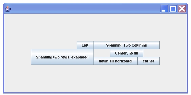
The GUI in the figure shown below contains most of the features of a grid needed in applications.
- Use of the method
spanto force a cell/component to span more then one column in a row. - Use of the method
spanVerticalto force a cell/component to span more than one row. - Use of the methods
setFixedWidthandsetFixedHeightto override the default behavior of components or cells when a window resizes. In this context, it should be noted that constraints on the size of a cell to be fixed are imposed after the cell has been laid out. In this example, if the grid height was not fixed, the left bottom button would expand vertically whenever the window is resized, and so would the width of the top right button if the grid width was not constrained.
 JFrame frame=new JFrame();
 frame.setDefaultCloseOperation(JFrame.EXIT_ON_CLOSE);
 Container container=frame.getContentPane();

 // Create components
 JButton left=new JButton("Left");
 JButton spantwocolumns=new JButton("Spanning Two Columns");
 JButton spantworows=new JButton("Spanning two rows, expanded");
 JButton centernofill=new JButton("Center, no fill");
 JButton downfillhoriz=new JButton("Down, fill horizontal");
 JButton corner=new JButton("Corner");

 // Create the rows of the grid.
 GridRows rows = new GridRows();

 // First Row
 rows.newRow().add(RIGHT,NO_ALIGNMENT,left).add(
              spantwocolumns).span(2);

 // Second Row
 rows.newRow().add(spantworows);
 rows.getCurrentRow().add(
              CENTER,NO_ALIGNMENT,centernofill).span(2);

 // Third Row. The spanVartical method
 // allows the cell in the correponding column of the previous
 // row to span the same column in this row as well.
 rows.newRow().spanVertical().add(downfillhoriz).add(corner);

 // Create the cell grid
 CellGrid grid=rows.createCellGrid();

 // Make the required component sizes to be flexible.
 grid.setFixedWidth(
     new Component[]{downfillhoriz,spantwocolumns},false);
 grid.setFixedHeight(new Component[]{spantworows},false);

 // Set the component gaps to be zero
 grid.setComponentGaps(0,0);

 // Put the grid in a centered column to center it in the window.
 Column column=new Column(CENTER,CENTER,grid);

 // Set the size of the grid to be fixed
 // after the components are laid out.
 column.setFixedWidth(new Cell[]{grid},true);
 column.setFixedHeight(new Cell[]{grid},true);

 // Create the layout.
 column.createLayout(container)
 // pack and show
 frame.pack();
 frame.show();
An Example of Baseline Alignment
As mentioned in the section on the summary of the API, PageLayout
also allows certain components like checkboxes and labels to be aligned
along the baseline of the line of the text that they contain. The first
figure below shows the GUI for an example in which the baseline alignment
constraint is not imposed. With baseline alignment, the text in the row on
the top of the grid is aligned and looks slighly better, as shown in the second
image below. As the subsequent program illustrates, the alignment constraint
can be imposed with a single line of code by calling the
method alignBaseline of the class Cell.
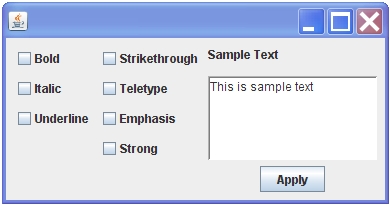
GUI without Baseline Alignment.
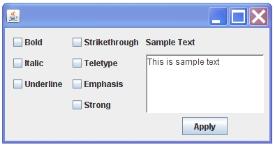
GUI with Baseline Alignment.
    JFrame frame=new JFrame();
    frame.setDefaultCloseOperation(JFrame.EXIT_ON_CLOSE);
    Container container=frame.getContentPane();

    // Create components
    JCheckBox bold=new JCheckBox("Bold");
    JCheckBox italic=new JCheckBox("Italic");
    JCheckBox underline=new JCheckBox("Underline");
    JCheckBox strikeThrough=new JCheckBox("Strikethrough");
    JCheckBox teletype=new JCheckBox("Teletype");
    JCheckBox emphasis=new JCheckBox("Emphasis");
    JCheckBox strong=new JCheckBox("Strong");
    JLabel sampleText=new JLabel("Sample Text");
    JButton apply=new JButton("Apply");
    JTextArea textArea=new JTextArea("This is sample text");
    textArea.setRows(5);
    textArea.setColumns(15);
    textArea.setBorder(BorderFactory.createLoweredBevelBorder());

    // The GridRows object
    GridRows rows=new GridRows();

    // The first row
    rows.newRow().add(bold,strikeThrough,sampleText);

    // To center the button, the editor and the button
    // are placed in a centered column.
    Cell textAndButton =new Column(Cell.CENTER,Cell.NO_ALIGNMENT,
    textArea,apply);

    // The second row.
    // The column containing text and button is the
    // third element.
    rows.newRow().add(italic,teletype).add(textAndButton);

    // The third row. The textAndButton cell
    //spans the third element of this row.
    rows.newRow().add(underline,emphasis).spanVertical();

    // The fourth row. The textAndButton cell
    // spans the third element of this row.
    rows.newRow().skip(1).add(strong).spanVertical();

    // Create the cell grid.
    CellGrid cellgrid=rows.createCellGrid();

    // Baseline alignment of the components in the first row.
    cellgrid.alignBaseline(bold,strikeThrough,sampleText);

    // Create layout.
    cellgrid.createLayout(container);

    frame.pack();
    frame.setSize(frame.getPreferredSize());
    frame.show();
An Advanced Example
The GUI, shown in the figure below, can be decomposed into a grid of two rows and three columns. The bottom row contains only a single row in the middle column. The top row contains three columns, with the main white panel in the middle. We give here the details of the construction of each of the four elements of the grid. Note that the created GUI is such that when the window size is increased the middle panel expands in a manner that the whole window area is occupied by the GUI elements. It should also be remarked that construction of this GUI by using any other single layout manager would be somewhat more difficult.
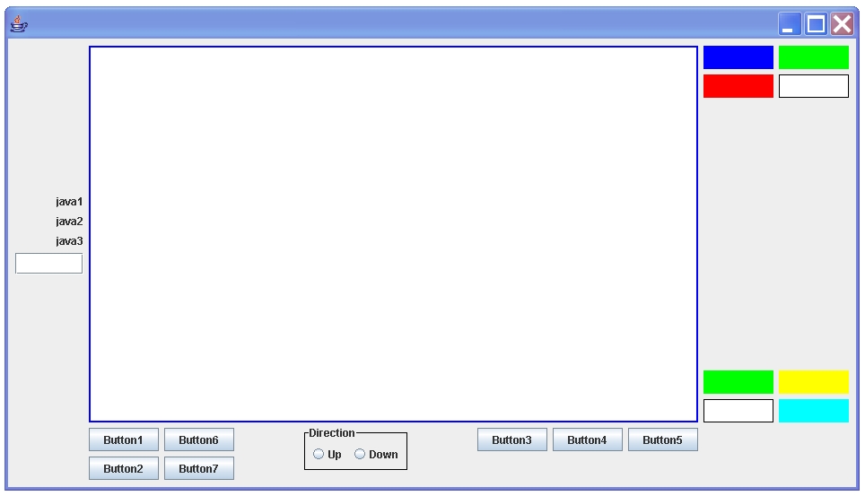
The top left column
The top left column is constructed simply from the three labels,
j1, j2, and j3 and the textfield j4 as
Column col00= new Column(Cell.RIGHT,Cell.CENTER,j1,j2,j3,j4);
We constrain the width and height of the textfield by using the
linkWidth and linkHeight methods of Cell and
allow the width of the textfield to change its size to accomodate the size of the container.
    // This constrains the width of j4 to be 2.5 times
    // the width of j3.
    col00.linkWidth(j3,new Component[]{j4},new double[]{2});
    // This constrains the height of j4 to be 1.5 times
    // the width of j3.
    col00.linkHeight(j3,new Component[]{j4},new double[]{1.5});
    Dimension dp=j4.getPreferredSize();
    Dimension dm=j4.getMaximumSize();
    // This constrains the width of j4 to grow/shrink
    //      and height to be fixed
    // (maximum height =preferred height).
    j4.setMaximumSize(new Dimension(Cell.MAX,dp.height));
The top middle column
The top middle column is just a row of the panel.
Row row01=new Row(midpanel);
The top right column
For the top right column we construct two separate groups
p1 and p2 and place them in the vertically justified
column. The width and height of all the panels in these groups are forced to
be identical. (When a null array is passed to linkHeight or
linkwidth it is assumed to be an array of ones.)
    Row p1=new Row(new Component[]{c1,c2},new Component[]{c3,c4});
    Row p2=new Row(new Component[]{d1,d2},new Component[]{d3,d4});
    Column col02=new Column(Cell.NO_ALIGNMENT,Cell.JUSTIFIED,p1,p2);
    col02.linkWidth(b1,new Component[]{c1,c2,c3,c4,d1,d2,d3,d4},
                                                (double[])null);
    col02.linkHeight(b1,new Component[]{c1,c2,c3,c4,d1,d2,d3,d4},
                                                 (double[])null);
The bottom middle column
Here the seven buttons are placed in two separate groups. The checkboxes are placed in a panel cell, and the three groups thus formed are used to construct a fully justified row.
    Row pageleftlow=new Row(new Component[]{b1,b2},
                              new Component[]{b6,b7});
    PanelCell pagemidlow=createButtonGroup();
    Row pagerightlow=new Row(new Component[]{b3,b4,b5});
    Row rowlow=new Row(Cell.JUSTIFIED,Cell.NO_ALIGNMENT,
	pageleftlow,pagemidlow,pagerightlow);
Here is the snippet of the code to construct the PanelCell for
the button group of two checkboxs cb1 and cb2
   JPanel p =new JPanel();
   // Create Button group
   ButtonGroup bg=new ButtonGroup();
   JRadioButton b1=new JRadioButton("Up");
   JRadioButton b2=new JRadioButton("Down");
   bg.add(b1);
   bg.add(b2);
   Border b=BorderFactory.createLineBorder(Color.black);
   p.setBorder(b=BorderFactory.createTitledBorder(b,"Direction"));
   // Row of buttons
   Row row=new Row();
   row.add(b1).add(b2);
   panelCell=PanelCell(p,row);
The whole window
Finally, all the four groups are used to construct a 2X3 grid in which
the elements at the bottom left and bottom right are empty spaces.
This cell grid being the top level cell of the GUI, its createLayout
method is called to (a) create the PageLayout layout manager for this GUI,
(b) set this created layout manager to be the layout manager for the
container, and (c) add to the container all the components in the tree which has the cell grid
as the root.
    // Create the grid
    CellGrid eg=CellGrid.createCellGrid(
       new Cell[][]{{col00,row01,col02},{null,rowlow,null}});

    // Create the main window
    // and the layout and show.
    JFrame frame=new JFrame();
    Container container=frame.getContentPane();
    eg.createLayout(container);
    frame.pack();
    frame.setSize(frame.getPreferredSize());
    frame.setVisible(true);
More examples can be found in the JavaDocs for PageLayout
in the JavaDocs.
Notes of Caution
For alignment of components and for the control of their
placement when the container resizes, the
PageLayout algorithm relies solely on the dimensions of
the components returned by the
getMinimumSize,
getPreferredSize and
getMaximumSize methods of the class
java.awt.Component. In some cases, the default values returned by
these methods may be such that the algorithm yields completely unexpected and
unsatisfactory results. For example, in JDK1.5, the default minimum and preferred
heights and widths
of the java.awt.Label
objects are zero, whereas javax.swing.JLabel objects
have default dimensions which work very well with the PageLayout
algorithm. Thankfully, the remedy in this case is quite simple and obvious.
The default minimum and preferred
dimensions of the javax.swing.JPanel objects are quite small, and these values
may sometimes need to be explicitly modified. An example is the simple case wherein
a button and panel are placed in a column, with the number of characters in the text
of the button being so large that the
width of the button is larger than the default preferred width of the panel. If
two such columns are set side by side, the available width will be divided on the basis of
of the widths of the buttons. If it is desired to rather divide the area on
the basis of the preferred width of the panels, these widths should be explicitly
modified to be larger than the widths of the buttons.
In summary, it may be possible to resolve
many issues which arise when the layout produced by PageLayout appears
to be inconsistent with the specified placements and constraints by simply modifiying the
minimum, preferred, and maximum dimensions of some components.